
I have always been complementary towards Adidas since they had the honour of designing Arsenal’s kits.
I credit them for thinking outside the box and refusing to play it safe when brainstorming ideas for the latest shirt Arsenal players will wear.
The manufacturer has to find that balance between originality and respecting tradition.
That’s why they have more creative freedom on the away merchandise as for the home version. They are aware that their customers don’t feel comfortable not having the red and white represented, leaving options limited.
That’s why I tend not to purchase the home shirt because 90 pound is a lot to pay, for what at times can be an identical product to the previous season.
The irony being that this is a rare summer where I have invested in the home shirt as I felt our sponsors traditional logo in gold, honouring our Invincibles, separates itself from previous jerseys of the same colour.
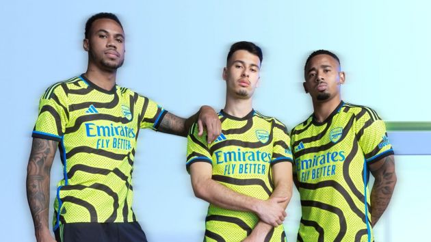
My decision seems to be vindicated when the club officially released their 2023-24 away outfit, confirming that most of the leaks were correct.
Law of averages, when your super creative not everything you throw at the wall is going to stick.
I’d much rather have a sponsor who gets the odd idea wrong because their imagination is bold compared to playing it safe every year.
The criteria to be original has led to some of the best clothing the Gunners have produced in years. The modern Bruised Banana, the red marble on white, last campaigns pink third kid …. our partners have been critically praised for products that have made our club a lot of money.
That’s not to say their latest effort won’t.
This is after all one of the biggest companies in the world who know what they are doing.
They will be aware the colours are so bright it will be divisive.
Yet their business model since working with us seems to be about being brave and I admire that.
They seem to want each away shirt to have its own story.
In the past they have been a link to our history, but their home option does that this year.
Instead, they claim the black squiggly lines are a reference to a map of Islington and roads of the different routes fans have to take when travelling away from the Emirates.
I like that concept but just not the colours.
Like we have some Gooners who can’t have anything negative said about the club, there will be some who will feel you become less of a supporter unless you buy this shirt.
As a grown adult, I can separate the two. Yes, the majority buy shirts because we want to represent our club in public and be part of the Arsenal family.
Yet, you still need to like what your wearing?
90 pound is a lot of money to pay for the sake of going to your local shop or getting on the bus while strangers wonder, ‘what’s he or she wearing?
We are after all experiencing a cost of living crisis. I feel sorry for the parents who are pressured to invest in their latest child’s kit, who must surely look at our away shirt on the shelf and say ‘sure you don’t want the home one instead?’
Like I said though, Adidas have got so many kits wrong due to their originality, it’s only natural they are going to get one wrong.
They got this one wrong.
I admire the thinking behind it though. They had an idea that had potential, but the execution was poor.
What do JustArsenal readers think? Out of 10 I’ll give it a 6.
Dan





CALLING ALL ARSENAL FANS! Anyone who would like to contribute an Article or Video opinion piece on JustArsenal, please contact us through this link…